-
Access the Platform
Log in to your IDXAddons platform account
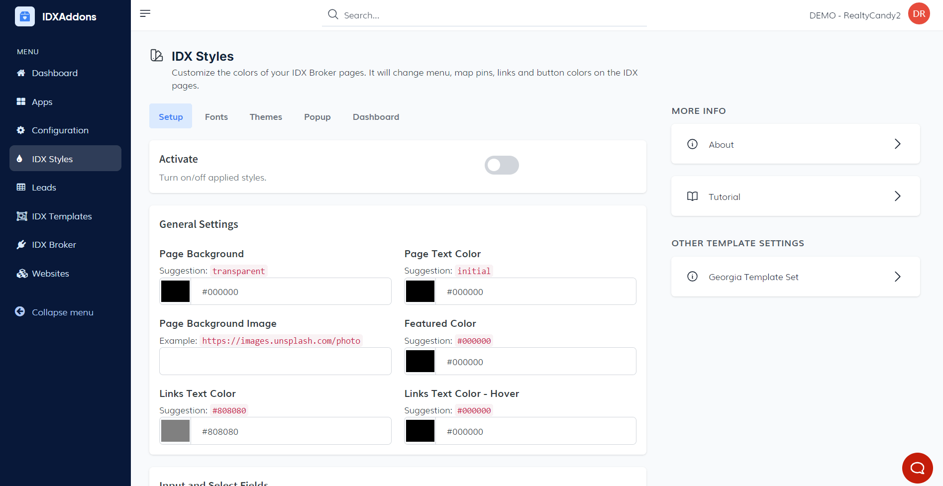
In the left menu, select the IDX Styles option.
-
Setup Tab Overview
In the Setup tab, you'll find several key options to customize the design and appearance of your IDX Pages.
Design Activation Toggle Button At the top, you'll see a toggle button that allows you to enable or disable the applied designs for IDX Pages. This gives you flexibility to switch between default and customized designs with ease.
General Settings Below the toggle, you'll find the General Settings section. Here, you can configure various elements of the page's design, such as:
- Page Background: Set the background color for the entire page.
- Page Text Color: Choose the color for the text on the page.
- Featured Color: Customize the featured color used across your site.
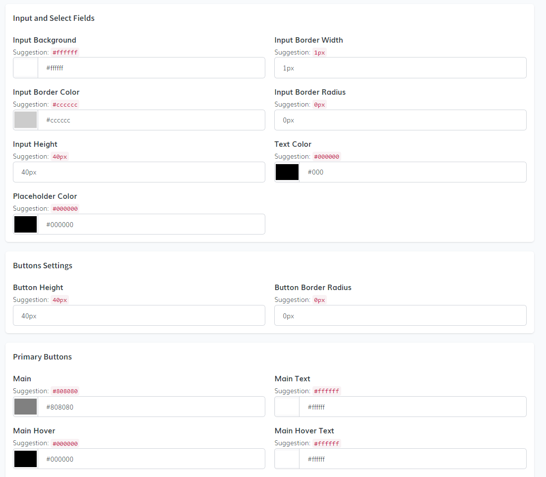
- Input and Select Fields: Adjust the appearance of form input fields and dropdown menus.
- Button Settings: Personalize button styles, including primary buttons and other elements across the page.
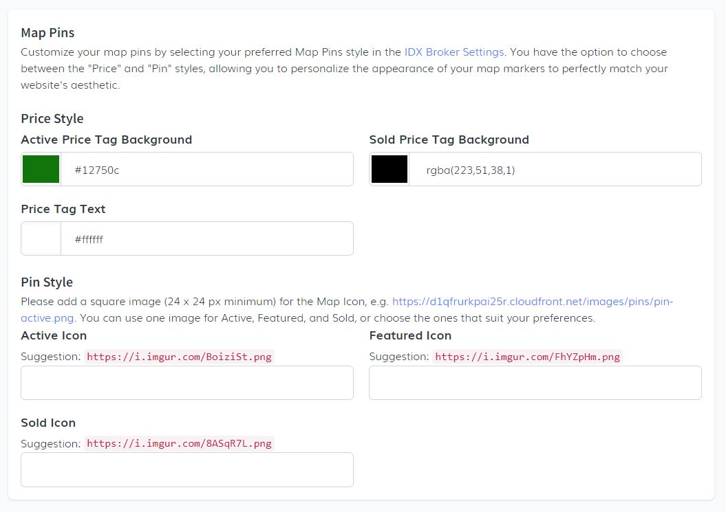
In the Map Pins section of the IDX Broker Settings, you can personalize your map markers to match your website's aesthetic. You have two styles to choose from:
- Price Style: Customize the background color for active price tags, set a different background color for sold price tags and choose a color for the price tag text.
- Pin Style: Upload a square image (minimum 24 x 24 px) for the Map Icon. You can use a single image for Active, Featured, and Sold states, or select different images for each. Suggested images can be found online or customized as per your preference.
Code Snippet: In this final step of the Setup section, it's important to note that the necessary code snippet for this app is already embedded within our IDX Templates. This means you don't need to manually add the code to the IDX Broker Sub-Headers.
-
Auto Match Your Brand Colors with AI
At the top of the Setup tab, the Match Your Brand's Colors panel lets you skip manual color picking entirely. Just paste your website's URL and let AI read your site's branding for you.
- Enter your website address (e.g. https://yourdomain.com) in the field and click Detect Colors.
- The AI reads your site's header, navbar, logo, and buttons and extracts a matching color palette (primary and secondary button colors, text colors, hover states, border styles) along with your main, title, and secondary fonts.
- Review the preview of your buttons and fonts, then click Show details to see the full breakdown of every color and style detected.
- Click Apply Colors to automatically fill in the corresponding fields below. Review the changes and hit Save when you're happy with the result.
This feature is currently in Beta, so results may need small manual tweaks depending on your site's design.
-
Fonts Customization
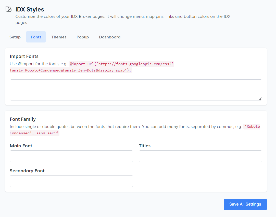
In the Fonts tab, you have the ability to customize the typography for your IDX pages by importing and setting the fonts that best suit your design.
- Import Fonts: You can use the @import rule to import external fonts, this allows you to incorporate fonts from external sources like Google Fonts into your page design.
- Font Family: When adding multiple fonts, remember to enclose fonts that require them in single or double quotes. For example, use 'Roboto Condensed', sans-serif. You can add several fonts, separating them with commas to create a fallback hierarchy in case a specific font fails to load.
- Main Font, Titles, and Secondary Font: Here, you can specify the main font for the body text, choose fonts for titles, and define a secondary font for other elements across your IDX pages.
-
Theme Selection
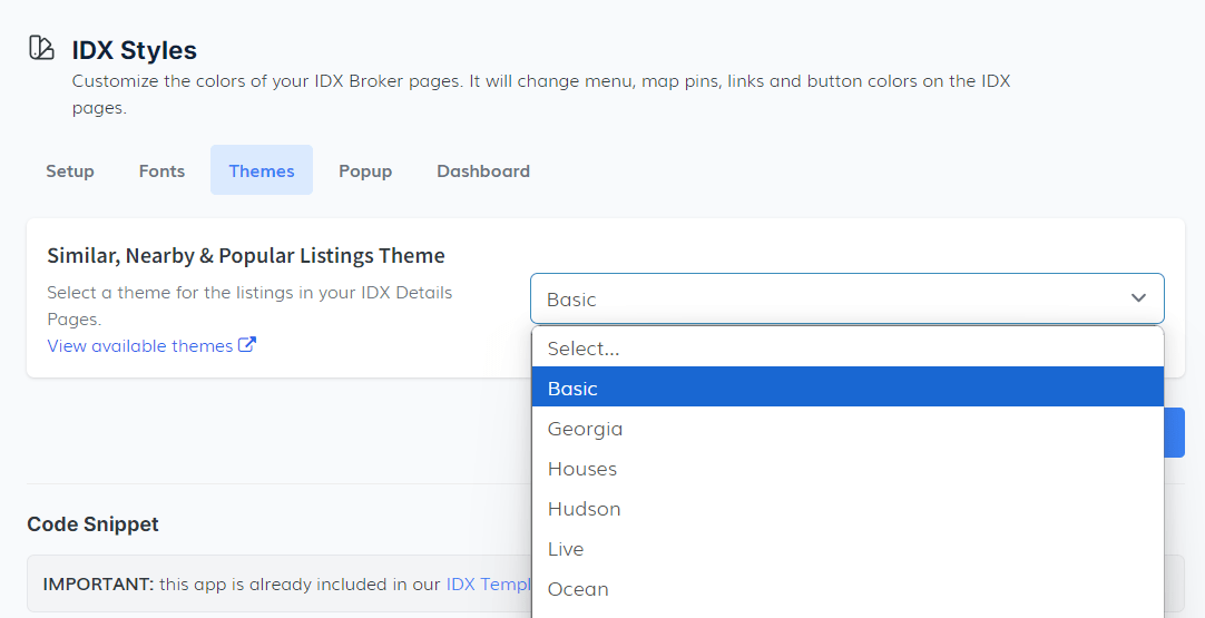
In the Theme tab, you can select the visual style for your IDX Details Pages. This section provides you with various theme options for similar, nearby, and popular listings.
- The dropdown menu offers several theme templates, such as Basic, Georgia, Houses, among others. Simply choose the one that aligns best with your website's design.
- Similar, Nearby & Popular Listings Theme: Choose a theme to determine how similar, nearby, and popular listings will be displayed on your IDX Details Pages, improving the visual appeal and usability of the page.
To preview these themes, click on the View available themes link for a live demo before finalizing your selection.
-
Pop-up Settings
In the Pop-up tab, you can customize the design, triggers, and content of registration pop-ups on your IDX pages. The settings are organized into three tabs: Appearance, Triggers, and Content.
View available themes for a live demo of the pop-up themes before making your selection.
- Appearance: Customize the visual style and themes of the registration pop-ups.
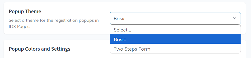
- Theme Selection: A dropdown menu allows you to select a theme for the pop-ups. Choose from the Basic theme or advanced themes like the Two Steps form. The Two Steps theme splits registration into two parts and can auto-fill the password field with the user's phone number (mimicking BoomTown).
- Pop-up Color and Settings: Customize the background overlay color, overlay opacity, box border, and border radius to align the popup's aesthetic with your website's brand identity.
- Triggers: Define precisely when and how often the registration pop-up is shown to your visitors.
- Global Settings:
- Show Frequency: Controls how often the popup appears for a single visitor:
- Once per session (resets when the browser tab closes).
- Once per day (once every 24 hours per visitor).
- Always (shows on every page open; not recommended).
- Registration Type: Choose between Ask for Registration (closable) and Force Registration (closing redirects visitors to the main IDX page).
- Campaign Mode (
?remreg=true): Appending?remreg=trueto any of your IDX page URLs sets a session cookie that suppresses the automatic display of the registration popup during that session. Visitors can still register manually. Ideal for landing pages linked from Google Ads, Facebook Ads, or email campaigns.
- Show Frequency: Controls how often the popup appears for a single visitor:
- Time Delay: Automatically displays the popup after a visitor remains on the page for a specified amount of time (e.g., 30 seconds, 3 minutes, 5 minutes). 3 minutes is the recommended duration.
- Photo Views: Triggers the popup once a visitor views a specific number of photos on a listing detail page (e.g., 5 photos threshold recommended).
- Exit Intent: Detects when a desktop visitor is about to leave your site (cursor exits the viewport) and triggers the popup. You can configure:
- Downloadable Resource: A URL to a resource (like a Buyer's Guide PDF) that becomes downloadable after registration.
- Pre-popup Offer Card: Shown before the registration form when a resource URL is set. You can customize the Card Image, Headline, Description, and CTA Button Text (e.g., "I want it!").
- Global Settings:
- Content: Personalize the text elements and legal compliance information shown inside the popup.
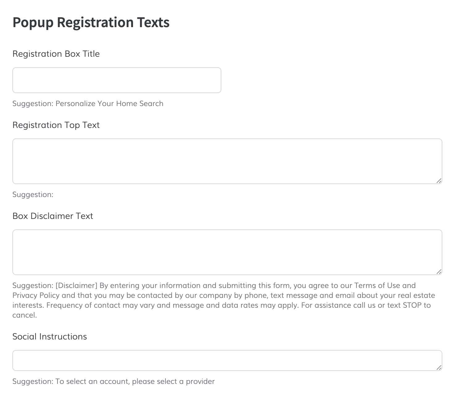
- Popup Registration Texts: Customize headings and instructions such as the Registration Box Title, Registration Top Text, Box Disclaimer Text, and Social Instructions.
- Consent Text: Add the compliance message displaying at the bottom of the popup, explaining how leads will be contacted and linking to your Terms of Use and Privacy Policy.
The Two Steps Form theme offers a unique registration experience by breaking the registration process into two steps. To fully utilize this theme, follow these additional steps:
- Go to IDX Styles and select the Two Steps theme from the Theme Selection dropdown. You can preview these popups on IDX pages when you save a search or property, or when an agent sets a view limit in the IDX settings.
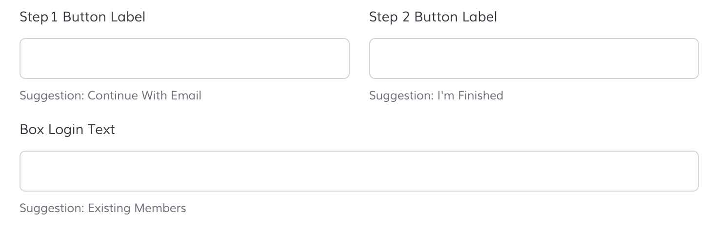
- To fully utilize the Two Steps theme, go to IDX Broker Registration Preferences and add a password field to the registration form. This password field will auto-fill with the phone number, mimicking BoomTown functionality.
- (Optional) Customize the content of each step of the registration process using the extra text fields in the Content section.
- Appearance: Customize the visual style and themes of the registration pop-ups.
-
Dashboard Customization
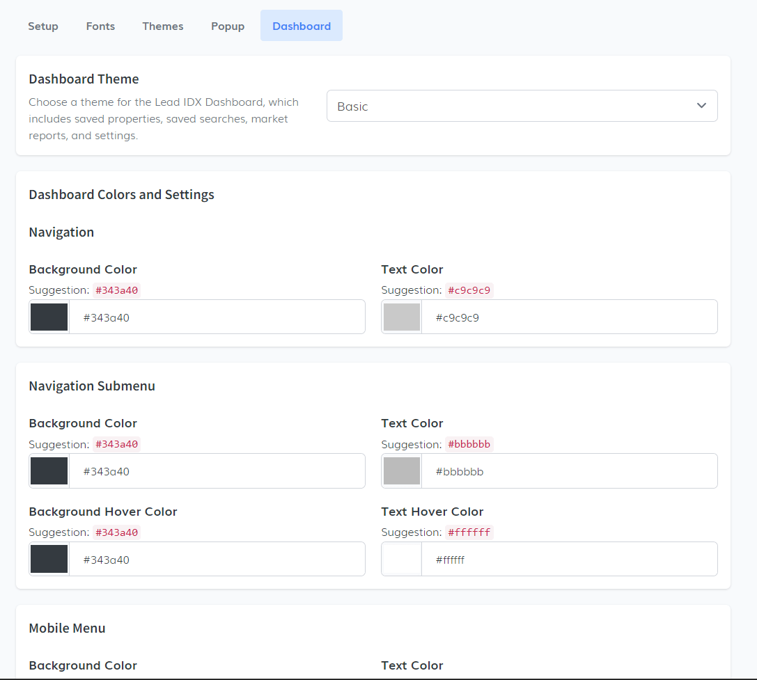
In the Dashboard tab, you can customize the visual theme for the Lead IDX Dashboard, which includes sections such as Saved Properties, Saved Searches, Market Reports, and general settings.
- Theme Selection: A dropdown menu is available to select the desired theme for the Lead IDX Dashboard. The default option is the Basic theme, but you can choose other themes depending on what best fits your site's look.
- Dashboard Color & Settings: Here, you can further personalize the dashboard with options for background color, text hover color, text color, and more. The flexibility allows users to fully tailor the dashboard's appearance to their preferences.
- Navigation Submenu & Mobile Menu: In this section, you can adjust the appearance of the dashboard's navigation submenu and mobile menu, again allowing for the selection of colors and styles to match the overall theme of your website.
With these settings, users can create a cohesive and visually appealing dashboard that enhances the experience for leads interacting with their saved searches and market reports.